

BACKGROUND
THE GOAL

CURRENT SCENARIO
TEAM COMPOSITION
KEY ROLE
Research
At first, I started with a heuristic analysis of the current product to understand it in more depth.
The primary research had already been conducted when I joined the team.
Using its insights along with my heuristic analysis I continued with the rest of the research analysis.
USER PERSONA
THE FANTASY CRICKET ENTHUSIAST
THE PASSIONATE BETTER
THE CRICKET ANALYST
JOBS TO BE DONE
BUSINESS GOALS UNDERSTANDING
Solution
The current product is live on their website
INFORMATION ARCHITECTURE

WIDGETS
Widgets are compact, interactive tools within SPODA AI that provide quick, actionable insights by organizing and presenting intricate sports data.
SECTIONS
Top Batsman/ Top Bowler
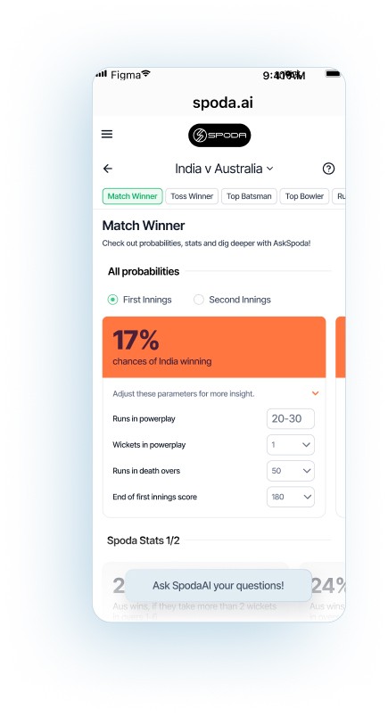
Match Winner
Toss Winner
Wickets/Runs
Widget Types
PROBABILITY WIDGET
The Probability widget shows the likelihood of a specific event, like a match outcome, and can either stay fixed or update in real-time based on conditions or user inputs.


SPODA STATS WIDGET
The Spoda Stats widget provides fixed probability percentages based on historical data, offering relevant information for the specific section being viewed.

DIG DEEPER WIDGET
The Dig Deeper widget dynamically presents AI-generated question prompts, tailored to the current section based on what the user might want to explore.


Sections
Sections
Testing and Redesign ✅
I performed user testing and the feedback receieved was used to enhance the designs
3 MAIN FEEDBACK
The AskSpoda text input bar at the bottom should be given more visual weight.
Complete Redesign of the Top Batsman and Top Bowler
Change in navigation
Redesigning AskSpoda Floating Widget ✨
THE PROBLEM
AskSpoda’s conversational widget, a key feature that sets Spoda apart from competitors, was not being used effectively.
User testing revealed that many people didn’t notice the widget at all.
The widget’s design blended too much with Spoda’s neutral and minimal color scheme, failing to stand out on a screen already filled with information.
Users didn’t realize they could tap or type on the widget, as it lacked visual cues to indicate interactivity.
Its overall appearance wasn’t engaging enough compared to other elements on the screen, despite being a critical feature.
THE SOLUTION
Adjusted the widget’s design to make it visually striking while maintaining harmony with the interface.
Chose a complementary color to the bright orange in Spoda’s palette to make the widget stand out.
Added a faded, blurred background behind the widget to subtly draw attention without overwhelming the user.
Redesigned the text bar into a floating button widget, making its interactivity clear and inviting.

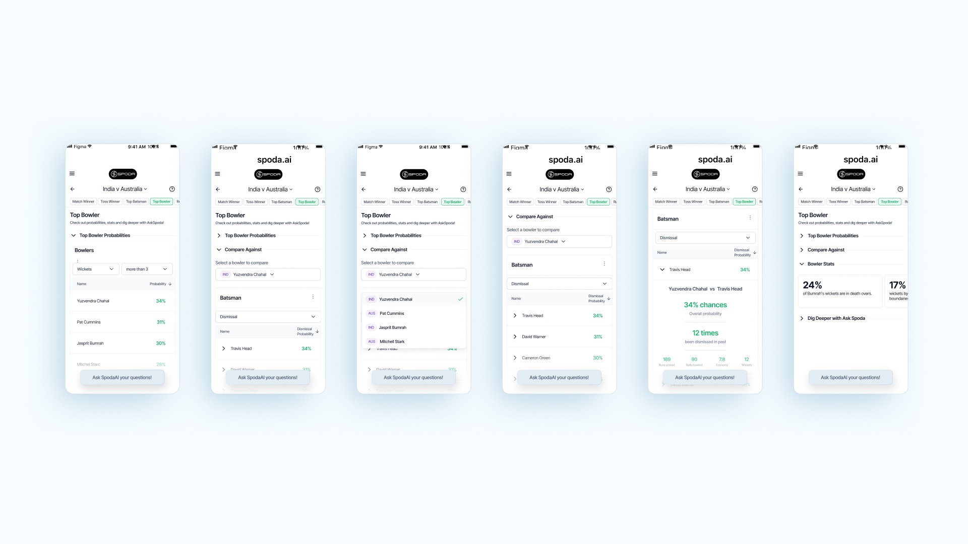
Redesigning Top Batsman and Top Bowler Sections ✨
CONTEXT
The Top Batsman and Top Bowler sections were designed to provide users with relevant player insights for informed betting decisions. This approach eliminates the need for users to type out questions, a task found to be challenging even for experienced analysts
THE PROBLEM
The Top Batsman and Top Bowler sections were designed to help users make informed decisions about individual players by presenting relevant insights. However, betting often involves comparisons between players, which our solution did not account for effectively.
The comparative process was cumbersome because:
Users had to navigate back and forth between multiple pages, increasing the number of clicks.
Information was scattered across different pages, making it difficult to retain and compare details in one view.
The lack of a centralized comparison interface made the experience inefficient and less intuitive.
Top Batsman - Top Bowler - Initial Design

THE SOLUTION
To address the issue, we shifted the focus from deep-diving into individual players to making comparisons easier by presenting information in a comparative format.
Here’s what was implemented:
Users now select a filter criterion (e.g., powerplay runs scored), and Spoda generates a ranked list of players based on that criterion.
For batsman vs. bowler comparisons, users select a batsman first, then choose a filter criterion to view a ranked list of bowlers relative to the chosen batsman.
This streamlined approach allows users to see, in one place, which player performs better under specific criteria, making it easier to identify who has a higher chance of winning a particular bet.
Top Batsman - Top Bowler - Post ReDesign
Redesigning the NavBar ✨
THE PROBLEM
User testing revealed that users struggled to navigate effectively and understand their current location within the app. Despite using breadcrumb navigation, users found it difficult to:
Determine which section they were in.
Easily return to the home page or previous sections.
Maintain a clear mental map of their navigation path.
THE SOLUTION
To improve navigation, the redesigned nav bar focused on:
Ensured users know where they are by displaying the match name in both the sticky nav bar and a scrollable section.
Made it clear how far users are from their destination and how to get there.
Added a single-click option to return to the homepage.
Enabled users to switch matches and swipe through tabs to select options for analysis.
Eliminated page reloads when switching tabs, making navigation faster and more seamless.


