Clickable Prototype
|
Figma File

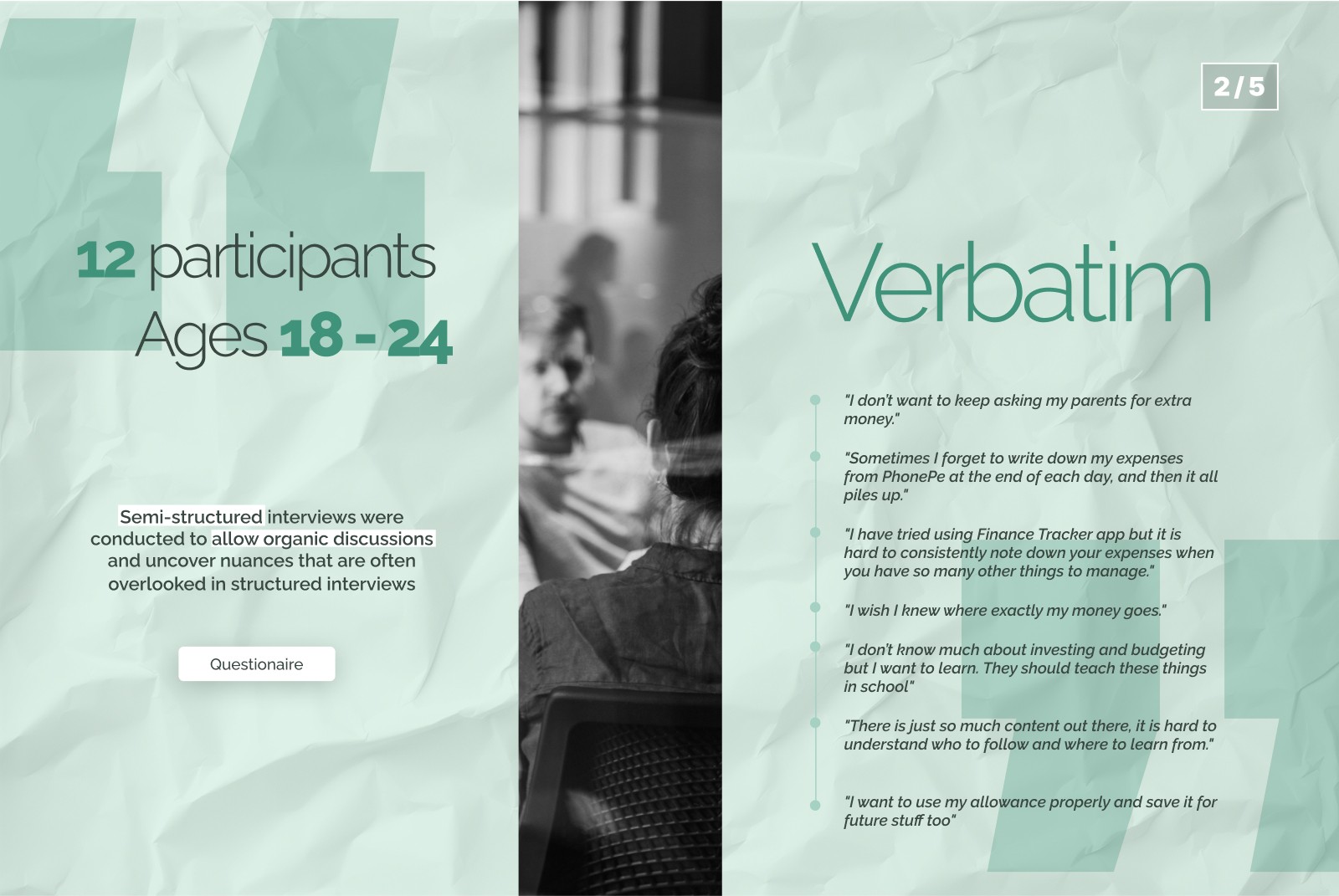
BACKGROUND
TIMELINE


JOBS TO BE DONE
PRODUCT FEATURES AND BENEFITS
Solution
Let me take you through the key screens and elements in them and what thought went behind it.
Let's go through the secyions one by one.
HOME SCREEN
The home screen is clean and minimal, offering a quick snapshot of your financial status at a glance.
Following the abstraction rule, only the most essential details are shown upfront, while deeper insights—like weekly analytics, spending categories, and savings—are just one tap away.
This ensures users stay informed without feeling overwhelmed.

BEHIND THE SCENES #1
Combining Home and Analytics
The initial Home and Analytics screen looked something like this.
It later occurred to me that even though the intention was to create a minimal home screen, this one was not solving the purpose.
The user was one click away from a lot of important analytics. Thus the idea was to combine them into one. If they user wanted more in-depth details we could guide them into a separate Expenses and Savings page.
A few more important changes from the initial version:
Remaining balance was highlighted, instead of overall expense
All expenses were shown in contrast to budget goal set for it
Expenses were grouped under Needs and Wants, as that as how a lot of youngsters learn to initially categorise money (The 50-30-20 rule)
The pie chart was removed as it didn't help with our - Financial status in one glance motive and was taking up a lot of space.

TRANSACTIONS
The Transactions screen consolidates all digital payment history in one place, sorted by date.
Users can search for specific transactions or manually add ones made via cash, cheques, or other methods.
*This feature was based on the assumption that most college students primarily use digital payment apps.

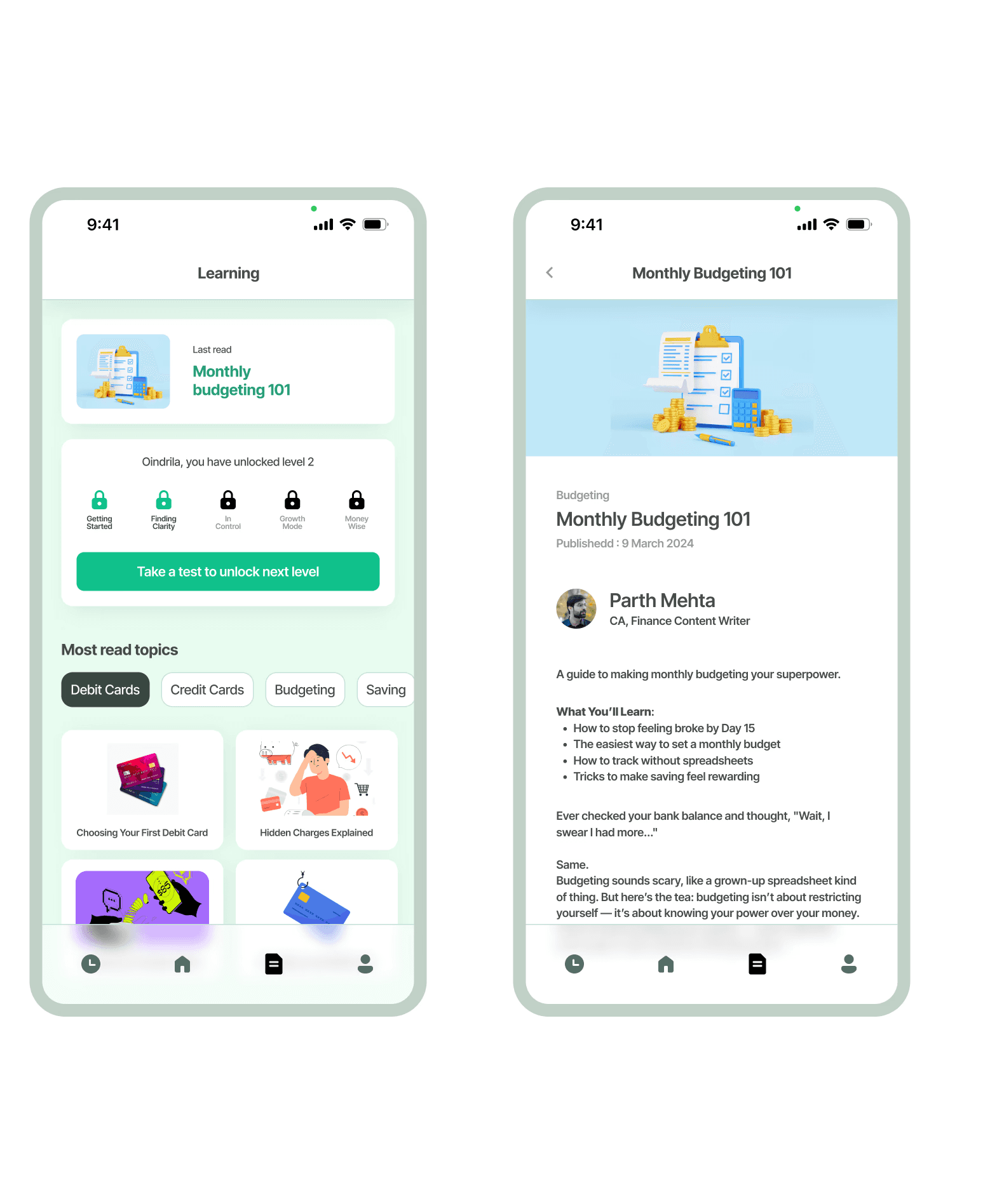
LEARNING
The Learning screen guides users through finance management in a simple, step-by-step way. Content is tailored to their level, unlocking new articles as they progress. The app also provides links to useful videos for deeper insights.
ONBOARDING
Onboarding is key to personalizing the app experience and building trust. It helps us understand user needs, current money management habits, and tailor features accordingly. Since users share sensitive financial data, establishing security and reliability from the start is essential.
Check out the other Projects

